Abstract
Space Series is a new
focus-plus-context technique for presenting both spatial and temporal data in a
single 2D plot. Initially, the display
shows an overview of the temporal distribution of the data. Focus is then
interactively applied along the X-axis, the Y-axis, or both, expanding the
spatial dimension of the data set. When focusing is applied simultaneously
along both axes, two-dimensional spatial details are shown at their
intersection. This visualization technique is illustrated with examples from a
simulation of architectural daylighting.
Keywords: focus + context, information visualization, daylighting, architectural simulation
Problem Overview
Space Series is a visualization prototype for displaying spatial data that varies across time such as daylighting or airflow in buildings. Advanced simulation programs represent this data with two plots (Figure 1). As a result, the user is forced to mentally compose both plots together in order to understand the data.
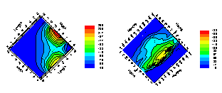 Figure 1. Typical building simulation
output. a) (left) spatial
distribution (length versus width) at a discrete point in time and b) (right) temporal distribution (days
versus hours) for the average of the entire room. In these figures, workplane illuminance is calculated for a room
with 2 windows. Changing the time
interval in a) or spatial region in b) requires the user to use a separate
control. Image obtained with permission
from running the system described in [4].
Figure 1. Typical building simulation
output. a) (left) spatial
distribution (length versus width) at a discrete point in time and b) (right) temporal distribution (days
versus hours) for the average of the entire room. In these figures, workplane illuminance is calculated for a room
with 2 windows. Changing the time
interval in a) or spatial region in b) requires the user to use a separate
control. Image obtained with permission
from running the system described in [4].
As with most visualization techniques, these types of plots only represent a fraction of the data set. A user who fails to adjust parameters in the simulation to obtain additional views makes an erroneous assumption about the behavior of the data at other times of year.
Space Series uses focus-plus-context techniques [7] in a novel way, presenting both spatial and temporal dimensions in a single 2D plot. Space Series embeds spatial data within two major axes representing time of day and day of year. Similar to traditional methods of display, in its initial state, Space Series provides the user with a global view of the data. This context is represented by reducing spatial data into a single data point via a user-specified function. The novelty arises from the users’ ability to focus into spatial regions along one or both time axes. Focusing on one axis produces one-dimensional spatial details. Focusing along both axes simultaneously produces an intersection that shows the original data, revealing 2D spatial details. Thus, at a global level, the user can see a temporal distribution, while focusing reveals the spatial dimension of the data set.
Architectural Daylighting
Example
In architectural design, workplane illuminance, or the spatial distribution of light incident to a horizontal surface, is an important qualification of lighting. The Illuminating Engineering Society of America [1] recommends ranges of illuminance levels for hundreds of activities such as reading or cooking. Daylighting (the light provided for by the sun) is often a major component of lighting design. Proper use of daylighting can reduce the amount of costly electrical lighting along with other environmental effects.
Current simulation programs use one of three basic strategies for representing daylighting. LumenMicro [3], the industry standard, requires the user to fill in text entry fields for selecting a single time for simulation (offering the user a plot similar to Figure 1a without 1b). Sumption et al. [8] proposed animation for simulating the temporal aspects of daylighting. Lastly, Papamichael (described in Figure 1) exemplifies a two-plot strategy.
Figures 2-4 illustrate how Space Series operates, displaying workplane illuminance pre-calculated by Radiance [2]. The simulation computes the illuminance at sixteen different locations within a room at two and a half feet off the floor. The model is square with a single southerly-facing window in Berkeley, California. Simulated days are IES ideal sky conditions [1].
Figure 2a shows space series without any foci. Day of year is shown on the X-axis (January 1 is leftmost) and hour of day on the Y-axis (5:00am is at the top of the axis). Much like the conventional plot in Figure 1b, each data point is represented as the maximum value for the lighting characteristics of the room at the indicated hour and date. Lighter grayscale values indicate higher workplane illuminance. This overview shows that in the winter there are more hours of high illuminance but fewer total hours of daylight than in the summer (this is due to the lower position and shorter path of the sun during the winter months). The pattern of illumination also highlights the spring and fall equinox and winter and summer solstice.
Figure 2b shows the same data with the hours of one day expanded for more detailed viewing. Within the focus bar is shown the maximum value for each of four north-south strips of the room. This display indicates that on March 25 the western side of the room gets more direct illumination during the morning, but becomes darker in the afternoon. The eastern side of the room experiences the opposite effect, being darker in the morning and lighter in the afternoon.
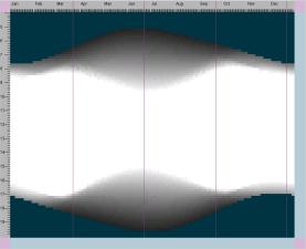
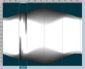
Figure 2. a) (top) Initial view with a
context region only, and b) (bottom)
the same view with a single focus region showing details for one day in the
spring.
In Figure 3a the user has added a horizontal focus. Note that the pattern of the horizontal focus is markedly different than that of the vertical focus. The horizontal slider indicates that the north side of the room, the side farthest from the window, receives less direct light during midday than does the front part of the room. The slider also indicates how this effect is strongest at the height of summer, and attenuates in the spring and fall. Where the two foci intersect, the actual 4x4 data is shown.
In Figure 3b the user has increased the number of days in the zoom regions from one to three. Showing several days simultaneously allows for inspection of the duration and robustness of a pattern. This intersection shows the actual data values for three contiguous hours and three contiguous days, thus yielding nine cells. Figure 4 illustrates a more elaborated scenario of the same simulation.
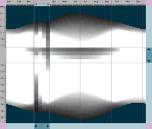
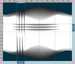
Figure 3. Focus regions revealing data at a particular time of
day and day of year. a) (left) at one day and time whose
intersection expresses the actual 4x4 underlying spatial data. b)
(right) reveals three contiguous days (vertical focus) and three contiguous
hours (horizontal focus). Nine sets of
actual data are shown at their intersection.
Each instance of spatial data has 16 measurements.
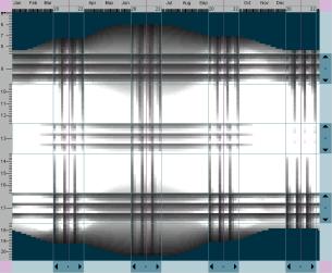
Figure 4. Zoom regions focused on
critical days (March, June, September, and December 22nd) and hours (9am, 1pm,
5pm) for a room with a single southerly-facing window. 108 sets of underlying data are in focus.
Artists have been known to prefer working in a room with a single northerly window due to its uniform lighting conditions. Figure 5 shows this assumption is mostly accurate, but noticeable variance occurs during the morning and evening hours near the summer equinox.
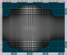
Figure 5. Workplane Illuminance for a
room with a single northern window.
Focus Plus Context
Strategy
Space Series presents five-dimensional data as a color 2D plot. In the daylighting examples, the two major axes are day of year and time of day. Horizontal and vertical focal bars can populate the plot creating four types of regions—context (C), day focus (Fd), fractional hour focus (Fh), and focus intersect (F2) (Figure 6). Each region has a distinct intrinsic coordinate system.
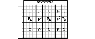 Figure 6. An example
layout consisting of C, Fd, Fh, and F2 regions. Smaller rectangles within regions outline
temporally distinct data. Note that
only F2 regions present data at a constant point in time.
Figure 6. An example
layout consisting of C, Fd, Fh, and F2 regions. Smaller rectangles within regions outline
temporally distinct data. Note that
only F2 regions present data at a constant point in time.
Every pixel in C represents a single spatial distribution for the day and fractional hour closest to its coordinate value. The user controls how the 2D source data is mapped onto this pixel. Currently the system allows the user to select the maximum, minimum, and average value as the representative pixel. When no focal bars are present, a single C region covers the entire plot similar to Figure 1b.
Regions Fd and Fh are focus areas that expand one dimension of the source data. Since Space Series displays data that are related, expanding an entire day or fractional hour can be beneficial for understanding the data set. A Fd region contains one or more consecutive days and reveals one spatial dimension of the data. The other spatial dimension is accounted for by a maximum, minimum, or average transform. Fh regions behave similarly for fractional hours across days.
F2 regions are created at the intersection between every Fd and Fh region. The source data is expanded along both axes to fit this region. Figure 7 illustrates some of these transforms.
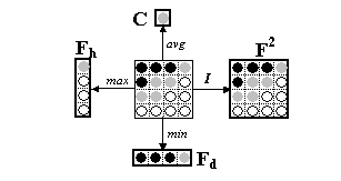 Figure 7. Region shapes and example transforms for each from 2D source data
(center). Fm, Fd, and C regions transform data for each
row, column, or both, respectively, by the maximum (max), minimum (min), and
average (avg) source value. As shown by
the small rectangles in Figure 2, these regions typically contain multiple
transforms. Points in F2 are
always represented by pixels with the identity transform (I). Note that lighter
pixels have higher values than darker pixels.
Figure 7. Region shapes and example transforms for each from 2D source data
(center). Fm, Fd, and C regions transform data for each
row, column, or both, respectively, by the maximum (max), minimum (min), and
average (avg) source value. As shown by
the small rectangles in Figure 2, these regions typically contain multiple
transforms. Points in F2 are
always represented by pixels with the identity transform (I). Note that lighter
pixels have higher values than darker pixels.
Space Series
Implementation
Space Series has two main graphical elements—a main visualization panel and a control panel. The main panel is composed of a visualization canvas, axes labels, and focus/context controls. The control panel manages the color scale, transformation preferences, and macro support.
The user can slide and resize focal regions directly in the main visualization area. To enhance the legibility of the data values, points on the canvas can be brushed and linked to a point and numerical value on the data scale.
Another major interaction element with Space Series is the zoom controller. Zoom controllers mediate the focus and context along both axes (on the lower and left sides of Figures 2-5). The user can create focus regions by adding zoom bars to the controller. The user can manually slide the bar to translate the focus region or press one of its two triangular targets to initiate animation. Macro buttons quickly configure the zoom controllers for pre-determined tasks. For example, there is an equinox/solstice button that, when pressed, will configure the horizontal zoom controller to have zoom bars at these four critical dates.
One of the prominent elements on the control panel is its color scale. Currently, we are experimenting with isomorphic, segmented and highlighted color scales [6]. Buttons on the control panel allow the user to control the merging transformations noted in the previous section.
Discussion and Related Research
This interface bears some significant relationships to the Table Lens [5]. The most prominent similarity is the spreadsheet-like layout of large amounts of data via the compression of the representation of the data points that are not in focus.
Space Series differs from the Table Lens in several significant ways. The Table Lens shows the data in one of two views. When in focus, the data is seen as a numeral or a textual string. When out of focus it is viewed as a glyph. Patterns can be seen within a single column by displaying the data values as glyphs. For example, quantitative values are typically viewed as bars whose length corresponds to a normalized function of the data values. Visual patterns are created by performing sequences of stable sorts of the values of adjacent columns, and then looking for correlations, outliers, and other patterns in the sorted columns. Each column’s data is displayed independently of the other columns’. There is no notion of sorting by row. When data is viewed by row, it is done only in focus mode, showing the actual underlying data values.
By contrast, in Space Series, the context can be shown as a function of the underlying data (average, maximum and minimum are implemented in the current prototype, but others could easily be incorporated). When a single horizontal or vertical focus slider is created, the actual data is not shown within the slider. Instead, a function of the data is shown, but in more detail than in the general context. This function in the lighting example retains some of the spatial properties of the room. One could imagine a variation on this in which the function is based on some attribute of data, rather than spatial properties. Only where horizontal and vertical foci intersect are actual data patterns found. To increase the number of actual data values that can be viewed compactly, multiple adjacent columns and rows can be viewed within one focus slider.
This use of a reduced representation for the data points outside the focus area allows for the presentation of significantly more data within the view. Each focal region adds a multiple of one axis’ points into the display depending on the resolution of the source data. More importantly, though, the mechanisms for shifting focus and context should allow better reconstruction of the full data set compared to traditional display methods[1]. It comes at a price, however, in that it relies on having data values on the axes whose order is meaningful. For example, if users were allowed to put data values for the month of June in front of January, it may confuse their overall understanding of lighting patterns throughout the year. Order is meaningful for both temporal and spatial data, however, so we anticipate this design being applicable to a wide range of data sets.
The original Table Lens had a size limitation for data sets so that it would be able to show all values at all times. Tenev and Rao expressed reservations about reducing the data since it would “hide singularities or even overall patterns” [9]. However, in their formulation of a three tier Table Lens to handle larger amounts of data, they were unable to avoid such reductions. Space Series retains the simplicity of having only two zoom levels along each axis (with an additional focus area at the intersection of two others), but at a cost of heavily relying on the transformation functions. Further research needs to be done in this area for handling larger data sets.
Future Research
Aside from performance optimizations, there are several areas for future research. Empirical research is needed to validate and refine these display and interaction methods. For example, viewing space in time (illustrated in this paper) versus time in space.
We plan to investigate the application of this visualization technique to other, less physically based types of datasets. We suspect that this view will be useful when displaying spatial data on the main axes and attribute information within the focus.
Space Series is an example of a potentially larger information visualization design space. In particular, the source space is only two-dimensional, but can be specified from a 3D source. Finally, the browser should interact flexibly with simulation tools, in order to generate data as the user explores it, rather than reading in static precomputed files of data.
We gratefully
acknowledge Charles Ehrlich for his generous mentoring of Glaser with
Radiance. We would also like to thank
Nancy Van House, Mark Gross, Jean-Pierre Protzen, Susan Ubbelohde, Ed Arens,
Andrea diSessa, Doris Aaronson, Humberto Cavallin, and Kostas Papamichael for
helping at various stages during this research.
References:
[1] Illuminating Engineering Society of North
America (1993) "IES Lighting Handbook", 8th Edition, New
York, NY.
[2] Larson, G. W., Shakespeare, R. (1998) “Rendering with Radiance:
the art and science of lighting visualization”, Morgan Kaufman, San Francisco,
CA.
[3] LD+A (1998) "Lighting Design Software
Survey", 28, 10, pp. 53-61.
[4] Papamichael, K., La Porta, J., Chauvet, H.
(1997) “The Building Design Advisor: automated integration of multiple
simulation tools”, Automation in Construction,
6, 4, pp. 341-352.
[5] Rao, R., and Card, S. (1994) “The Table Lens:
Merging graphical and symbolic representations in an interactive focus+context
visualization for tabular information”, in Human
Factors in Computing Systems CHI ’94 Conference Proceedings, pp. 318-322.
[6] Rogowitz, B. and Treinish, L. (1998) “Data
Visualization: the end of the rainbow”, IEEE
Spectrum, 35, 12, pp. 52-59.
[7] Spence, R., and Apperley, M.D., (1982)
“Data-base navigation: an office environment for the professional”, Behaviour and Information Technology, 1,
1, pp. 43-54.
[8] Sumption, B., Haglund, B., Zabrodsky, A.,
(1991) “Imagining Light: A Visualization of Daylighting Data”, in CAAD Futures '91, Zurich, pp. 97-104.
[9] Tenev, T., and Rao, R., (1997) “Managing Multiple
Focal Levels in Table Lens”, Proceedings
of IEEE Information Visualization ’97, pp. 59-63.