Marti A. Hearst
Professor
University of California, Berkeley
Research: TileBars
- the relative length of each retrieved document,
- the frequency of the topic words in the document, and
- the distribution of the topic words with respect to the document and to each other.
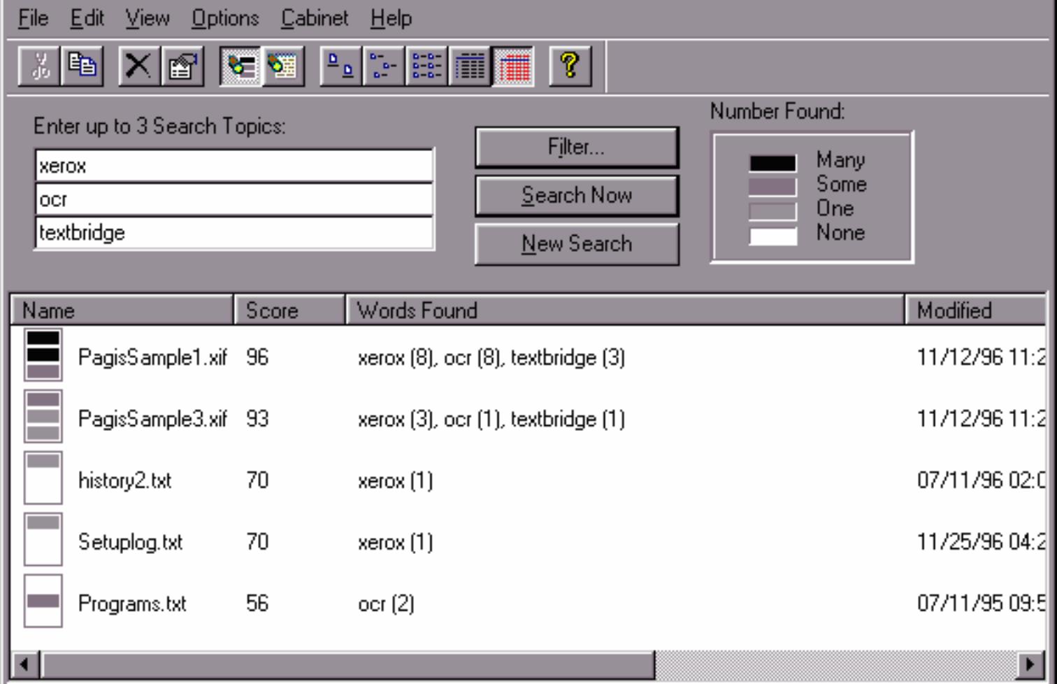
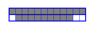
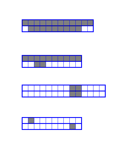
- The first TileBar in the example above appears to have main topics about both medicine and diagnosis.
- The second TileBar has a main topic discussion of medicine, and a subtopic discussion of diagnosis.
- The third TileBar has an overlapping subtopic discussion of medicine and diagnosis
- The fourth and last TileBar has passing references to both topics, but it can be seen that there is no overlap between them. Probably the two terms are not related in a meaningful way.
Preamble: The TileBars project was an early exploration into the use of information visualization for search user interfaces. A more up to date discussion and more followon work can be found in Chapter 11 of Search User Interfaces by Marti Hearst, Cambridge University Press, 2009. The initial work took place in 1993-1995 and the description below was written in 1997.
To many users, the way search engines choose to rank retrieved documents is a bit of a mystery. The TileBars interface was an attempt to show the user, graphically, the relationship between the words in the query and the documents retrieved.
The interface requires the user to break up the query into a list of topics. More than one word can be used to represent each topic. For example, medicine, medical, hospital can all be used to retrieve medical documents. If hits on all topics overlap within a single passage, the document is more likely to be relvant. A user would most likely find it difficult to use a query language to specify exaclty how the topic words should overlap. Instead, the TileBars interface presents this information graphically and allows the user to look for patterns most likely to suit what is being sought.
Thus, the TileBars interface allows the user to make informed decisions about which retrieved documents and which passages of those documents to view, based on the how the query terms are distributed in the documents. The goal is to simultaneously and compactly show:
In one version of the interface, each document is partitioned in advance into a set of multi-paragraph subtopical segments using an algorithm called TextTiling. (This is why it is called TileBars.) Other units of text can be substituted, for example, pages or paragraphs.
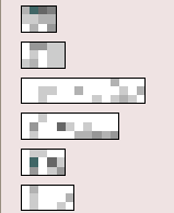
In the graphical representation, each large rectangle indicates a document, and the relative lengths of the rectangles correspond to the relative lengths of the documents.
The query is specified in terms of k topics, one topic per line, called term sets . Usually the topic is written as a list of synonyms or related words. For example, the topic of medicine might be specified as medicine medical doctor hospital . The top row of each TileBar correspond to the hits for the first term set (e.g., medicine) , and the bottom row to the second term set (e.g, diagnosis).
The first column of each rectangle corresponds to the first segment of the document, the second column to the second segment, and so on.

The darker the segment or tile, the more frequently the query term occurs in that part of the document (in these illustrations only one level of ggrey is shown. White indicates no hits on the terms in the corresponding topic).
The patterns of darkness indicate something about the relationship between the documents and the query terms. Continuing the medical diagnosis example, consider the following set of TileBars:
Note again that the different lengths of the rectangles correspond to the different lengths of the documents. Continuing with the example of medicine and diagnosis ,
The user can click on a tile in the TileBar and go directly to the most interesting-looking part of the document. Associated with each topic is a color, and the words corresponding to each topic is highlighted with the corresponding color.
Two examples of TileBars in action:
First we show an example run on a query about efforts at technology transfer of research at Xerox and PARC, run on a text collection of over 1 million newswire, newspaper, magazine and government articles, dating mainly from the late 1980's. The query consists of three topics, or Term Sets, where each set of terms is meant to correspond to a topic of the query:

The TileBars for the most relevant looking cluster (from the results of a Scatter/Gather) are shown. The ranking reflects criteria specific to this interface: the highest-ranked documents contain passages with hits for words in all three topics. The total number of hits on all words and, and the score from a standard ranking algorithm are also taken into account. The score shown is the standard ranking score.
Each large rectangle indicates a document, and each square within the document represents a coherent text segment. The darker the segment, the more frequent the term (white indicates 0, black indicates 8 or more hits, the frequencies of all the terms within a term set are added together). The top row of each rectangle correspond to the hits for Term Set 1, the middle row to hits of Term Set 2, and the bottom row to hits of Term Set 3. The first column of each rectangle corresponds to the first segment of the document, the second column to the second segment, and so on.
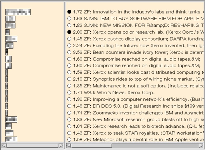
In this example we can see at a glance that all three topics are discussed in at least one segment in each of the first dozen or so documents, but that the last four documents discuss only Xerox and research, with no mention of business or technical transfer. We can also see the relative lengths of the documents and how strongly the three topics overlap within the documents. It is evident that two documents of very similar makeup appear towards the middle of the output, and that they discuss all three topics, but only towards the end.
As a second example, consider the use of TileBars as part of a more comprehensive interface. Here the query is:
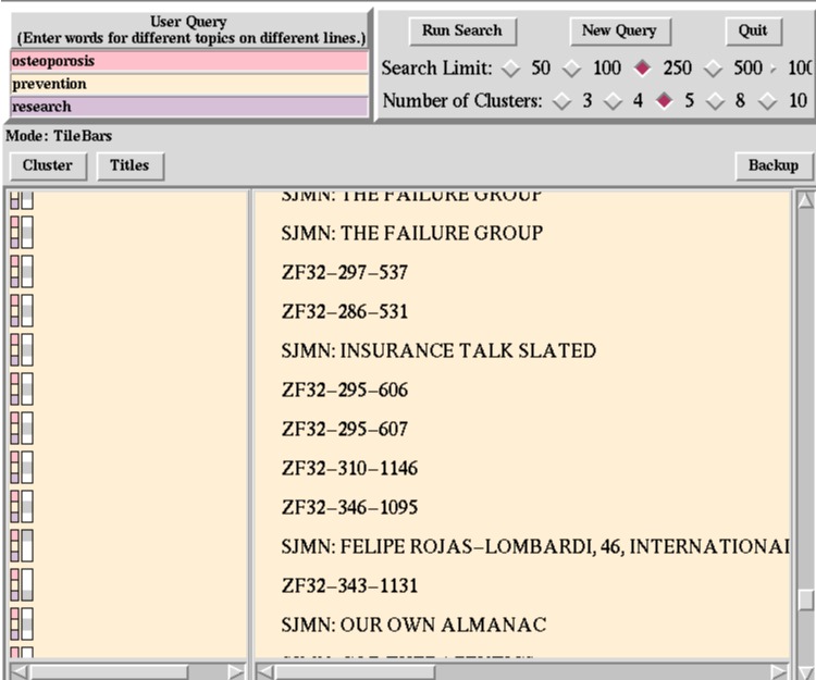
To accommodate the TileBars interface, users are required to enter their queries into a sequence of entry windows, as shown in the upper lefthand corner of the interface. The user is told that each line should correspond to a different topic of the query. Each entry line is called a termset since it is meant to contain a set of terms representing one topic. In this example, the participant has broken the query into three topics (in this case there is only one word per topic): osteoperosis, prevention, and research.
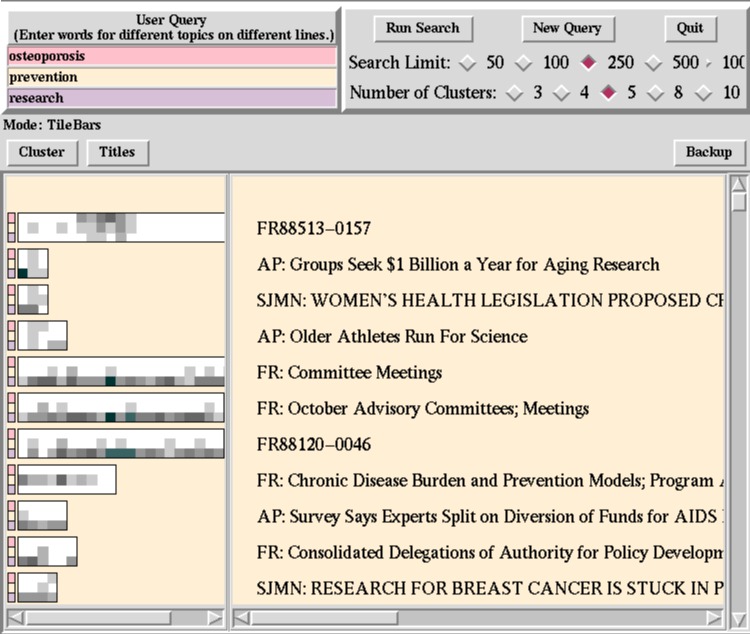
As before, the top row of each TileBar corresponds to osteoporosis, the second row to prevention, and the third row to research. Each row of each rectangle is comprised of a sequence of squares. Each square indicates a segment of the document; the leftmost square indicates the first segment, or paragraph, or other unit, of the document, the square to the right of this indicates the second segment of the document, and so on. The darkness of the square corresponds to the number of times the query occurs in that segment of text; the darker the square the greater the number of hits. White indicates no hits on the query term. Thus the user can quickly see if some subset of the terms overlap in the same segment of the document. (The segments for this version of the interface are fixed blocks of 100 tokens each.)
The first document can be seen to have considerable overlap among the topics of interest towards the middle, but not at the beginning or the end (the actual end is cut off). Thus it most likely discusses topics in addition to research into osteoporosis.
The second through fourth documents, which are considerably shorter, also have overlap among all terms of interest, and so are also probably of interest to the user. (The titles help to verify this.)
The next three documents are all long, and from the TileBar we can tell they discuss research and prevention, but do not even touch on osteoporosis! So they are probably not of interest.
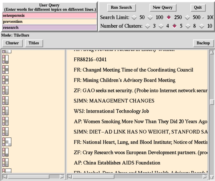
The following figure shows what happens when the topmost TileBar is clicked on in the center of the dark pattern. Note that since this article does not have a title associated with it, it would have been difficult to determine if it were relevant without a TileBar or some other kind of summary information.

The terms of the query are highlighted in the document display window; each color corresponds to a different line of the user query. The portion of the document shown is one where the term hits overlap. A sentence is visible that states ``Research is revealing that prevention may be achieved through estrogen replacement therapy for older women ...'' and the rest of the context indicates that thing to be prevented is osteoporosis. This snippet of text also shows that the document consists of a sequence of news bites about different topics, confirming what the TileBar led us to suspect. Also note that the last snippet discusses osteoporosis and prevention, but not research, as reflected in the TileBar.
The next figure shows how TileBars indicate, as we quickly scroll down the list, that most of the remaining documents are not of interest. They do not discuss all the terms of interest and so are less likely to be useful. Although some look potentially relevent, they seem mainly to discuss treatment of existing osteoporosis, but not prevention of it. Nevertheless, ometimes the TileBars can be misleading because the user did not specify all the words in the query that might be used to discuss a topic. We are interested in ways to account for this problem, possibly by using automatically generated thesauri.

As we go further down the list we see that the rest of the documents are short and do not discuss the disease in question:
The collection used here was the TREC/Tipster collection, provided by NIST.
Publications
We published several technical papers about TileBars, and other researchers have made use of them or discussed related work. First, the best, most focused paper:
- Hearst, M. TileBars: Visualization of Term Distribution Information in Full Text Information Access, Proceedings of the ACM SIGCHI Conference on Human Factors in Computing Systems (CHI), Denver, CO, 1995. pdf ps (6.5M) ps (gz) html (at sigchi)
Next, an anecdotal description of the users responses to TileBars as part of an interface that uses Scatter/Gather as
- Hearst, M., Pedersen, J., Pirolli, P., Schütze, H., Grefenstette, G. and Hull, D., Four TREC-4 Tracks: the Xerox Site Report, Proceedings of the Fourth Text REtrieval Conference (TREC-4), Donna Harman (ed.), Nov 1-3, Arlington, VA, 1996. pdf ps (gz)
The next paper shows that the kind of ranking conducive to TileBars actually performs better in a standard Information Retrieval measurement framework than a standard ranking algorithm (vector space) when evaluting on very short queries at high levels of precision.
- Hearst, M., Improving Full-Text Precision on Short Queries using Simple Constraints, Proceedings of the Fifth Annual Symposium on Document Analysis and Information Retrieval (SDAIR), Las Vegas, NV, April 1996. pdf ps (1.3M) ps (gz)
A videotape that shows both TileBars and Scatter/Gather.
- Marti Hearst and Jan Pedersen, Revealing Collection Structure through Information Access Interfaces, Video track on the Proceedings of the International Joint Conference on Artificial Intelligence (IJCAI), Montreal, Canada, Volume II, 2047-2048, 1995.
A shorter version of this videotape that shows only TileBars.
- Marti Hearst and Jan Pedersen, Visualizing Information Retrieval Results: A Demonstration of the TileBars Interface, Video track on the in the Proceedings of the ACM SIGCHI Conference on Human Factors in Computing Systems (CHI), May 1996.
Commercial Use of TileBars
A simplified version of TileBars has been incorporated into Pagis Pro97, a full-featured scanning software package that is integrated into the Windows 95/NT desktop. The product allows users to capture, use and organize scanned color documents and incorporate them into the Windows Explorer file system.
Pagis Pro97 also includes a version of Xerox's TextBridge Pro OCR software (OCR stands for Optical Character Recognition -- this is used to convert scanned images of text into text that can be edited by word processors). Using the OCR software, users can convert the images to searchable text. For this reason, Pagis also includes a search tool. so users can search for words in the documents they scanned in as well as any other documents on their computer's disk.
This tool is built on top of the Verity Topic search engine. As in TileBars, the user is encouraged to break their query up into multiple topics, and approximate number of hits for word in each topic is shown by varying gray levels in a small icon. However, MatchBars do not show the location in the document in which the hits occur. Instead, they show the approximate number of hits for each topic throughout the document.