Chapter 10: User Interfaces and Visualization - by Marti Hearst

Contents
|
Modern Information Retrieval Chapter 10: User Interfaces and Visualization - by Marti Hearst |
Contents |
Search interfaces must provide users with good ways to get started. An empty screen or a blank entry form does not provide clues to help a user decide how to start the search process. Users usually do not begin by creating a long, detailed expression of their information need. Studies show that users tend to start out with very short queries, inspect the results, and then modify those queries in an incremental feedback cycle [anick94]. The initial query can be seen as a kind of `testing the water' to see what kinds of results are returned and get an idea of how to reformulate the query [waterworth91][bates89]. Thus, one task of an information access interface is to help users select the sources and collections to search on.
For example, there are many different information sources associated with cancer, and there are many different kinds of information a user might like to know about cancer. Guiding the user to the right set of starting points can help with the initial problem formulation. Traditional bibliographic search assumes that the user begins by looking through a list of names of sources and choosing which collections to search on, while Web search engines obliterate the distinctions between sources and plunge the user into the middle of a Web site with little information about the relationship of the search hit to the rest of the collection. In neither case is the interface to the available sources particularly helpful.
In this section we will discuss four main types of starting points: lists, overviews, examples, and automated source selection.
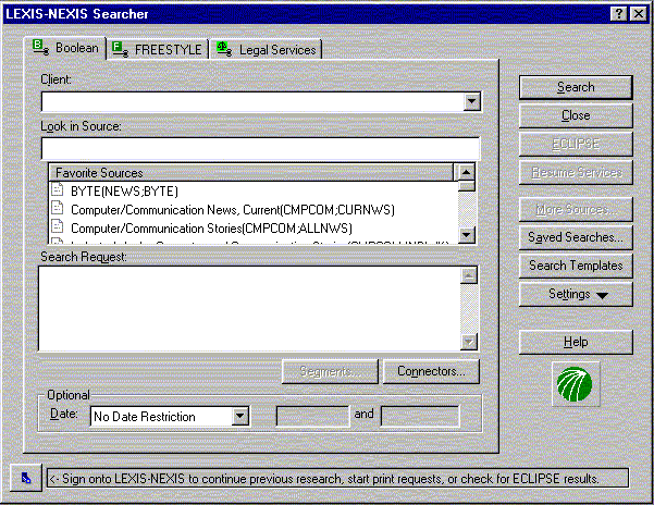
Typical online systems such as LEXIS-NEXIS require users to begin any
inquiry with a scan through a long list of source names and guess
which ones will be of interest. Usually little information beyond the
name of the collection is provided online for these sources (see
Figure ![[*]](cross_ref_motif.gif) ). If the user is not satisfied with
the results on one collection, they must reissue the query on another
collection.
). If the user is not satisfied with
the results on one collection, they must reissue the query on another
collection.
Frequent searchers eventually learn a set of sources that are useful for their domains of interest, either through experience, formal training, or recommendations from friends and colleagues. Often-used sources can be stored on a `favorites' list, also known as a bookmark list or a hotlist on the Web. Recent research explores the maintenance of a personalized information profile for users or work groups, based on the kinds of information they've used in the past [freeman95].
However, when users want to search outside their domains of
expertise, a list of familiar sources is not sufficient. Professional
searchers such as librarians learn through experience and years of
training which sources are appropriate for various information needs.
The restricted nature of traditional interfaces to information
collections discourages exploration and discovery of new useful
sources. However, recently researchers have devised a number of
mechanisms to help users understand the contents of collections as a
way of getting started in their search.
Faced with a large set of text collections, how can a user choose which to begin with? One approach is to study an overview of the contents of the collections. An overview can show the topic domains represented within the collections, to help users select or eliminate sources from consideration. An overview can help users get started, directing them into general neighborhoods, after which they can navigate using more detailed descriptions. Shneiderman [shneiderman96] advocates an interaction model in which the user begins with an overview of the information to be worked with, then pans and zooms to find areas of potential interest, and then view details. The process is repeated as often as necessary.
Three types of overviews are discussed in this subsection. The first is display and navigation of large topical category hierarchies associated with the documents of a collection. The second is automatically derived overviews, usually created by unsupervised clustering techniques on the text of documents, that attempt to extract overall characterizing themes from collections. The third type of overview is that created by applying a variant of co-citation analysis on connections or links between different entities within a collection. Other kinds of overviews are possible, for example, showing graphical depictions of bookshelves or piles of books [rose93][yates96].
There exist today many large online text collections to which category
labels have been assigned. Traditional online bibliographic systems
have for decades assigned subject headings to books and other
documents [sven]. MEDLINE, a large collection of
biomedical articles, has associated with it Medical Subject Headings
(MeSH) consisting of approximately 18,000 categories [lowe94].
The Association for Computing Machinery (ACM) has developed a
hierarchy of approximately 1200 category (keyword)
labels.![[*]](foot_motif.gif) Yahoo![yahoo], one of the most popular search sites on
the World Wide Web, organizes Web pages into a hierarchy consisting of
thousands of category labels.
Yahoo![yahoo], one of the most popular search sites on
the World Wide Web, organizes Web pages into a hierarchy consisting of
thousands of category labels.
The popularity of Yahoo! and other Web directories suggests that hierarchically structured categories are useful starting points for users seeking information on the Web. This popularity may reflect a preference to begin at a logical starting point, such as the home page for a set of information, or it may reflect a desire to avoid having to guess which words will retrieve the desired information. (It may also reflect the fact that directory services attempt to cull out low quality Web sites.)
The meanings of category labels differ somewhat among collections. Most are designed to help organize the documents and to aid in query specification. Unfortunately, users of online bibliographic catalogs rarely use the available subject headings [hancock-beaulieu92b][drabenstott96]. Hancock-Beaulieu and Drabenstott and Weller, among others, put much of the blame on poor (command line-based) user interfaces which provide little aid for selecting subject labels and require users to scroll through long alphabetic lists. Even with graphical Web interfaces, finding the appropriate place within a category hierarchy can be a time-consuming task, and once a collection has been found using such a representation, an alternative means is required for searching within the site itself.
Most interfaces that depict category hierarchies graphically do so by associating a document directly with the node of the category hierarchy to which it has been assigned. For example, clicking on a category link in Yahoo! brings up a list of documents that have been assigned that category label. Conceptually, the document is stored within the category label. When navigating the results of a search in Yahoo!, the user must look through a list of category labels and guess which one is most likely to contain references to the topic of interest. A wrong path requires backing up and trying again, and remembering which pages contain which information. If the desired information is deep in the hierarchy, or not available at all, this can be a time-consuming and frustrating process. Because documents are conceptually stored `inside' categories, users cannot create queries based on combinations of categories using this interface.
It is difficult to design a good interface to integrate category
selection into query specification, in part because display of
category hierarchies takes up large amounts of screen space. For
example, Internet Grateful Med is
a Web-based service that allows an integration of search with display
and selection of MeSH category labels. After the user types in the
name of a potential category label, a long list of choices is shown in
a page. To see more information about a given label, the user selects
a link (e.g., Radiation Injuries). The causes the context of the
query to disappear because a new Web page appears showing the
ancestors of the term and its immediate descendants. If the user
attempts to see the siblings of the parent term (Wounds and Injuries)
then a new page appears that changes the context again. Radiation
Injuries appears as one of many siblings and its children can no long
be seen. To go back to the query, the illustration of the category
hierarchy disappears.
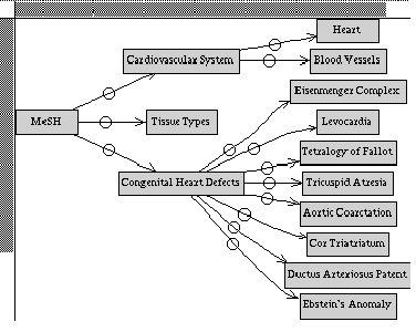
The MeSHBrowse system [korn95] allows users to interactively
browse a subset of semantically associated links in the MeSH
hierarchy. From a given starting point, clicking on a category causes
the associated categories to be displayed in a two-dimensional tree representation.
Thus only the relevant subset of the hierarchy is shown at one time,
making browsing of this very large hierarchy a more tractable
endeavor. The interface has the space limitations inherent in a two-dimensional
hierarchy display and does not provide mechanisms for search over an
underlying document collection. See Figure .
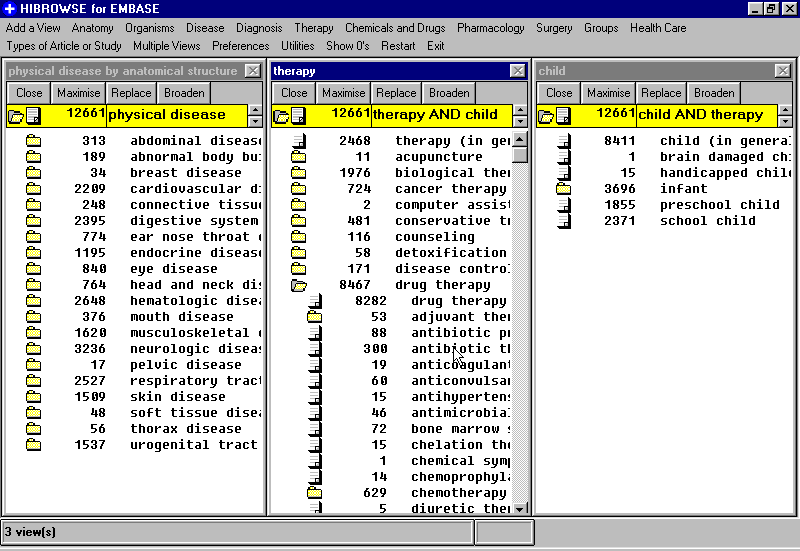
The HiBrowse system [pollitt97] represents category metadata more
efficiently by allowing users to display several different subsets of
category metadata simultaneously. The user first selects which
attribute type (or facet, as attributes are called in this system) to
display. For example, the user may first choose the `physical
disease' value for the Disease facet. The categories that appear one
level below this are shown along with the number of documents that
contain each category. The user can then select other attribute
types, such as Therapy and Groups (by age). The number of documents
that contain attributes from all three types are shown. If the user
now selects a refinement of one of the categories, such as the
`child' value for the Groups attribute, then the number of documents
that contain all three selected facet types are shown. At the same
time, the number of documents containing the subcategories found
below `physical disease' and `therapy (general)' are updated to
reflect this more restricted specification. See Figure
. A problem with the HiBrowse system is that it
requires users to navigate through the category hierarchy, rather than
specify queries directly. In other words, query specification is not
tightly coupledwith display of category metadata.
As a solution to some of these problems, the Cat-a-Cone interface
[hearst97b] will be described in section .
Many attempts to display overview information have focused on automatically extracting the most common general themes that occur within the collection. These themes are derived via the use of unsupervised analysis methods, usually variants of document clustering. Clustering organizes documents into groups based on similarity to one another; the centroids of the clusters determine the themes in the collections.
The Scatter/Gather browsing paradigm [cutting92][cutting93] clusters documents into topically-coherent groups, and presents descriptive textual summaries to the user. The summaries consist of topical terms that characterize each cluster generally, and a set of typical titles that hint at the contents of the cluster. Informed by the summaries, the user may select a subset of clusters that seem to be of most interest, and recluster their contents. Thus the user can examine the contents of each subcollection at progressively finer granularity of detail. The reclustering is computed on-the-fly; different themes are produced depending on the documents contained in the subcollection to which clustering is applied. The choice of clustering algorithm influences what clusters are produced, but no one algorithm has been shown to be particularly better than the rest when producing the same number of clusters [willett88].
A user study [pirolli96] showed that the use of Scatter/Gather on a large text collection successfully conveys some of the content and structure of the corpus. However, that study also showed that Scatter/Gather without a search facility was less effective than a standard similarity search for finding relevant documents for a query. That is, subjects allowed only to navigate, not to search over, a hierarchical structure of clusters covering the entire collection were less able to find documents relevant to the supplied query than subjects allowed to write queries and scan through retrieval results.
It is possible to integrate Scatter/Gather with conventional search
technology by applying clustering on the results of a query to
organize the retrieved documents (see Figure
). An offline experiment [hearst96e]
suggests that clustering may be more effective if used in this manner.
The study found that documents relevant to the query tend to fall
mainly into one or two out of five clusters, if the clusters are
generated from the top-ranked documents retrieved in response to the
query. The study also showed that precision and recall were higher
within the best cluster than within the retrieval results as a whole.
The implication is that a user might save time by looking at the
contents of the cluster with the highest proportion of relevant
documents and at the same time avoiding those clusters with mainly
non-relevant documents. Thus, clustering of retrieval results may be
useful for helping direct users to a subset of the retrieval results
that contain a large proportion of the relevant documents.
General themes do seem to arise from document clustering, but the
themes are highly dependent on the makeup of the documents within the
clusters [hearst96e][hearst98a]. The unsupervised nature of
clustering can result in a display of topics at varying levels of
description. For example, clustering a collection of documents about
computer science might result in clusters containing documents about
artificial intelligence, computer theory, computer graphics, computer
architecture, programming languages, government, and legal issues.
The latter two themes are more general than the others, because they
are about topics outside the general scope of computer science.
Thus clustering can results in the juxtaposition of
very different levels of description within a single display.
Scatter/Gather shows a textual representation of document clusters.
Researchers have developed several approaches to map documents from
their high dimensional representation in document space into a 2D
representation in which each document is represented as a small glyph
or icon on a map or within an abstract 2D space. The functions for
transforming the data into the lower dimensional space differ, but the
net effect is that each document is placed at one point in a
scatter-plot-like representation of the space. Users are meant to
detect themes or clusters in the arrangement of the glyphs. Systems
employing such graphical displays include BEAD [chalmers92], the
Galaxy of News [rennison94], and ThemeScapes [wise95]. The
ThemeScapes view imposes a three-dimensional representation on the
results of clustering (see Figure ). The layout
makes use of `negative space' to help emphasize the areas of
concentration where the clusters occur. Other systems display
inter-document similarity hierarchically [maarek94][allen93], while
still others display retrieved documents in networks based on
inter-document similarity [fowler91][thompson89].
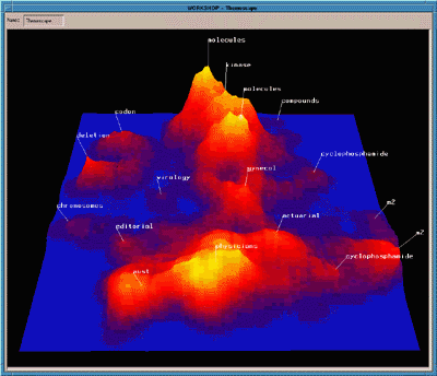
Kohonen's feature map algorithm has been used to create maps that
graphically characterize the overall content of a document collection
or subcollection [lin91][hchen98] (see Figure ).
The regions of the 2D map vary in size and shape corresponding to how
frequently documents assigned to the corresponding themes occur within
the collection. Regions are characterized by single words or phrases,
and adjacency of regions is meant to reflect semantic relatedness of
the themes within the collection. A cursor moved over a document
region causes the titles of the documents most strongly associated
with that region to be displayed in a pop-up window. Documents can be
associated with more than one region.
Although intuitively appealing, graphical overviews of large document spaces have yet to be shown to be useful and understandable for users. In fact, evaluations that have been conducted so far provide negative evidence as to their usefulness. One study found that for non-expert users the results of clustering were difficult to use, and that graphical depictions (for example, representing clusters with circles and lines connecting documents) were much harder to use than textual representations (for example, showing titles and topical words, as in Scatter/Gather), because documents' contents are difficult to discern without actually reading some text [kleiboemer96].
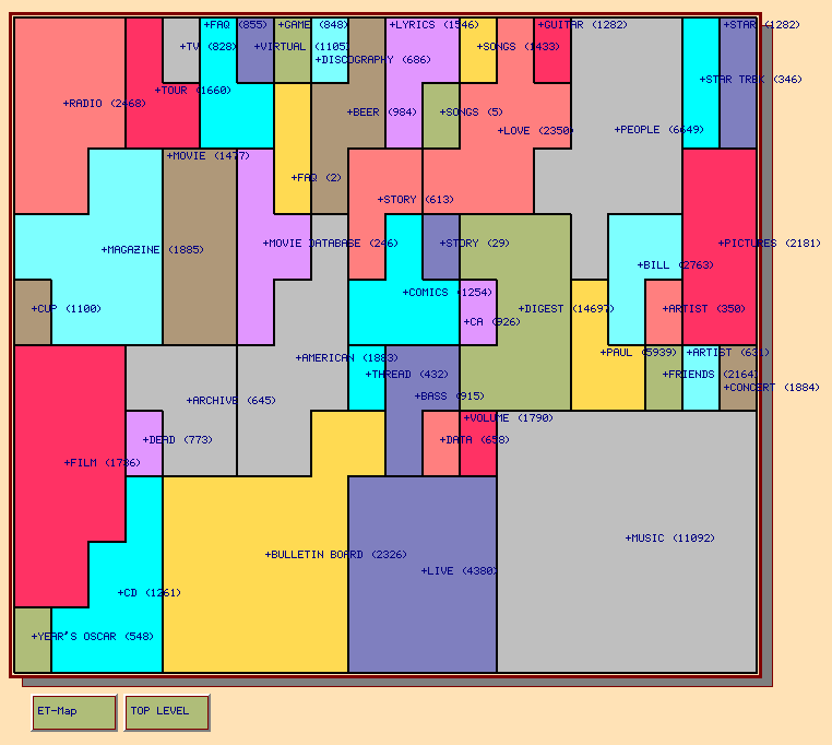
Another recent study compared the Kohonen feature map overview representation on a browsing task to that of Yahoo! [hchen98]. For one of the tasks, subjects were asked to find an `interesting' Web page within the entertainment category of Yahoo! and of an organization of the same Web pages into a Kohonen map layout. The experiment varied whether subjects started in Yahoo! or in the graphical map. After completion of the browing task, subjects were asked to attempt to repeat the browse using the other tool. For the subjects that began with the Kohonen map visualization, 11 out of 15 found an interesting page within ten minutes. Eight of these were able to find the same page using Yahoo!. Of the subjects who started with Yahoo!, 14 out of 16 were able to find interesting home pages. However, only two of the 14 were able to find the page in the graphical map display! This is strong evidence against the navigability of the display and certainly suggests that the simple label view provided by Yahoo! is more useful. However, the map display may be more useful if the system is modified to tightly integrate querying with browsing.
The subjects did prefer some aspects of the map representation. In particular, some liked the ease of being able to jump from one area to another without having to back up as is required in Yahoo!, and some liked the fact that the maps have varying levels of granularity. The subjects disliked several aspects of the display. The experimenters found that some subjects expressed a desire for a visible hierarchical organization, others wanted an ability to zoom in on a subarea to get more detail, and some users disliked having to look through the entire map to find a theme, desiring an alphabetical ordering instead. Many found the single-term labels to be misleading, in part because they were ambiguous (one region called `BILL' was thought to correspond to a person's name rather than counting money).
The authors concluded that this interface is more appropriate for casual browsing than for search. In general, unsupervised thematic overviews are perhaps most useful for giving users a `gist' of the kinds of information that can be found within the document collection, but generally have not been shown to be helpful for use in the information access process.
Citation analysis has long been recognized as a way to show an overview of the contents of a collection [white89]. The main idea is to determine `centrally-located' documents based on co-citation patterns. There are different ways to determine citation patterns: one method is to measure how often two articles are cited together by a third. Another alternative is to pair articles that cite the same third article. In both cases the assumption is that the paired articles share some commonalities. After a matrix of co-citations is built, documents are clustered based on the similarity of their co-citation patterns. The resulting clusters are interpreted to indicate dominant themes within the collection. Clustering can focus on the authors of the documents rather than the contents, to attempt to identify central authors within a field. This idea has recently been implemented using Web-based documents in the Referral Web project [kautz97]. The idea has also been applied to Web pages, using Web link structure to identify major topical themes among Web pages [larson96b][pirolli96b]. A similar idea, but computed a different way, is used to explicitly identify pages that act as good starting points for particular topics (called `authority pages' by Kleinberg [kleinberg98]).
Another way to help users get started is to start them off with an example of interaction with the system. This technique is also known as retrieval by reformulation. An early version of this idea is embodied in the Rabbit system [williams84] which provides graphical representations of example database queries. A general framework for a query is shown to the user who then modifies it to construct a partially complete description of what they want. The system then shows an example of the kind of information available that matches this partial description. For instance, if a user searching a computer products database indicates an interest in disks, an example item is retrieved with its disk descriptors filled in. The user can use or modify the displayed descriptors, and iterate the procedure.=+1
The idea of retrieval by reformulation has been developed further
and extended to the domains of user interface development
[myers88b] and software engineering [redmiles91].
The Helgon system [fischer89] is a modern variant of this idea
applied to bibliographic database information. In Helgon, users begin
by navigating a hierarchy of topics from which they select structured
examples, according to their interests. If a feature of an example is
inappropriately set, the user can modify the feature to indicate how
it would appear in the desired information. Unfortunately, in tests
with users, the system was found to be problematic.
Users had
problems with the organization of the hierarchy, and found that
searching for a useful example by critiquing an existing one to be
tedious. This result underscores an unfortunate difficulty with examples
and dialogues: that of getting the user to the right starting dialogue or
the right example strategy becomes a search problem in itself. (How to
index prior examples is studied extensively in the case-based
reasoning (CBR) literature [leake96][kolodner93].)
A more dynamic variation on this theme is the interactive dialog. Dialog-based interfaces have been explored since the early days of information retrieval research, in an attempt to mimic the interaction provided by a human search intermediary (e.g., a reference librarian). Oddy did early work in the THOMAS system, which provided a question and answer session within a command-line-based interface [oddy77b]. More recently, Belkin et al. have defined quite elaborate dialog interaction models [belkin93] although these have not been assessed empirically to date.
The DLITE system interface [cousins97b] uses an animated focus-plus-context dialog as a way to acquaint users with standard sequences of operations within the system. Initially an outline of all of the steps of the dialog is shown as a list. The user can expand the explanation of any individual step by clicking on its description. The user can expand out the entire dialog to see what questions are coming next, and then collapse it again in order to focus on the current tactic.=1
A more restricted form of dialog that has become widely used in commercial products is that of the wizard. This tool helps users in time-limited tasks, but does not attempt to overtly teach the processes required to complete the tasks. The wizard presents a step-by-step shortcut through the sequence of menu choices (or tactics) that a user would normally perform in order to get a job done, reducing user input to just a few choices with default settings [phelps94]. A recent study [carliner98] found wizards to be useful for goals that require many steps, for users who lack necessary domain knowledge (for example, a restaurant owner installing accounting software), and when steps must be completed in a fixed sequence (for example, a procedure for hiring personnel). Properties of successful wizards included allowing users to rerun a wizard and modify their previous work, showing an overview of the supported functions, and providing lucid descriptions and understandable outcomes for choices. Wizards were found not to be helpful when the interface did not solve a problem effectively (for example, a commercial wizard for setting up a desktop search index requests users to specify how large to make the index, but supplies no information about how to make this decision). Wizards were also found not to be helpful when the goal was to teach the user how to use the interface, and when the wizard was not user-tested. It maybe the case that information access is too variable a process for the use of wizards.
A guided tour leads a user through a sequence of navigational
choices through hypertext links, presenting the nodes in a logical
order for some goal. In a dynamic tour, only relevant nodes are
displayed, as opposed to the static case where the author decides what
is relevant before the users have even formulated their queries
[guinan92]. A recent application is the Walden Paths project
which enables teachers to define instructionally useful paths through
pages found on the Web [furuta97]. This approach has not been
commonly used to date for
information access but could be a promising
direction for acquainting users with search strategies in large
hyperlinked systems.
Human-computer interfaces for helping guide users to appropriate sources is a wide open area for research. It requires both eliciting the information need from users and understanding which needs can be satisfied by which sources. An ambitious approach is to build a model of the source and of the information need of the user and try to determine which fit together best. User modeling systems and intelligent tutoring systems attempt to do this both for general domains [cypher93][wilensky84] and for online help systems [horvitz98].
A simpler alternative is to create a representation of the contents of information sources and match this representation against the query specification. This approach is taken by GlOSS, a system which tries to determine in advance the best bibliographic database to send a search request to, based on the terms in the query [tomasic97]. The system uses a simple analysis of the combined frequencies of the query words within the individual collections. The SavvySearch system [howe97] takes this idea a step further, using actions taken by users after a query to decide how to decrease or increase the ranking of a search engine for a particular query (see also Chapter 13).
The flip side to automatically selecting the best source for a query is to automatically send a query to multiple sources and then combine the results from the various systems in some way. Many metasearch engines exist on the Web. How to combine the results effectively is an active area of research, sometimes known as collection fusion [bartell94][towell95][hull96].